THIS WEBSITE

About
This website is written almost entirely in plain HTML and CSS. The point of this website is to help teach myself web design, and make a personal website that looks good enough to show off to employers and friends. The design of the site has evolved over many months as I learned of new ways to do things and thought of more elements that would look cool. I also sometimes use the site to host pieces of projects for classes. To see the history of changes I've made to the site, check out the git repository.
The HTML and CSS is written entirely from scratch by myself, without any website-building tool or service. The only program I use is a simple text editor (Notepad++ on Windows and Vim on GNU/Linux), and Chomiums's developer tools. The site was originally hosted using GitHub Pages, but in July 2018 I switched to self hosting it on a server I built and set up (see below).
Unfortunately, one of the issues I've run into is that I don't know what to actually write! It turns out that creating good-looking pages is a lot easier than coming up with interesting content to put on them.
I also struggled a lot with CSS at first. It's hard to wrap your head around how all the rules interact with each other for someone used to functional and imperative programming languages. For example, it took me a lot of frustrating trial and error to figure out how to get these heading styles working, but once I figured it out it was all worth it.
FADES ARE COOL
Keep reading for details on some specific elements of the site.
seen.js
Although I want my websites to be completely usable without JavaScript, I still use some here and there, for eye candy or simple games and projects. The visualizations on the projects and other pages were created using seen.js, a JavaScript framework for rendering 3D scenes into an SVG or HTML5 canvas.
These visualizations are not necessary for navigating the site, so I consider them an acceptable use of JavaScript. They add a bit of flavor and color to the pages while using less bandwidth and loading faster than images.
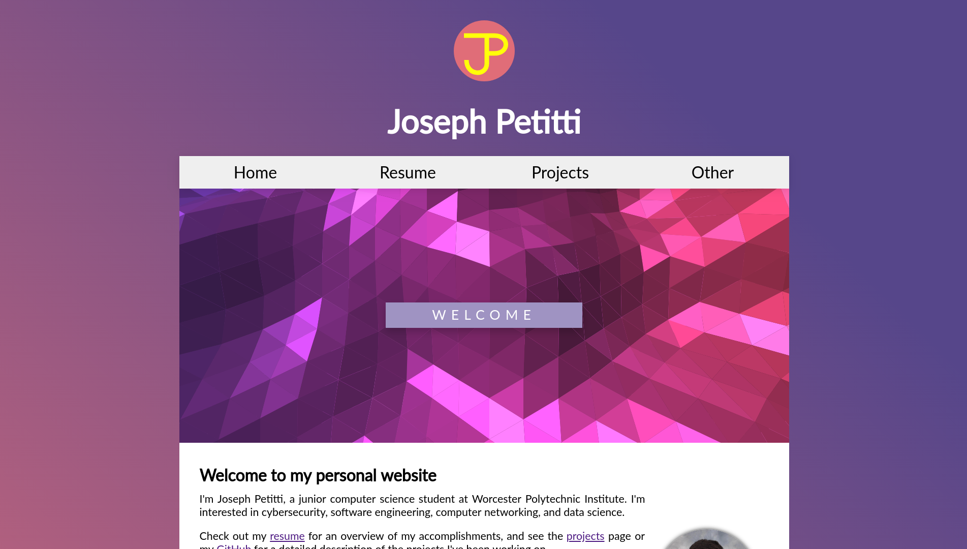
Logo
My personal logo, shown on the left, is a design I came up with as a kid. I'm red-green colorblind, so I find it easier to just pick colors randomly than to try spend time trying to figure out what looks good together. As a result, the color scheme is completely arbitrary.
To make it load fast and scale well on different-sized screens, I made the logo an SVG. Knowing nothing about graphic design, I painstakingly wrote the code for the SVG by hand, and it is reproduced in all its glory below:
Self Hosting
In July of 2018 I decided to stop relying on GitHub Pages and host the website on my own server. This decision came for several reasons. GitHub Pages was a nice service, but it doesn't have good support for HTTPS. Also, if I ever want my website to be anything but static HTML pages and client-side scripts GitHub Pages won't work for my needs any more. Plus, I had an old computer lying around and a strong desire to learn about servers and networking.
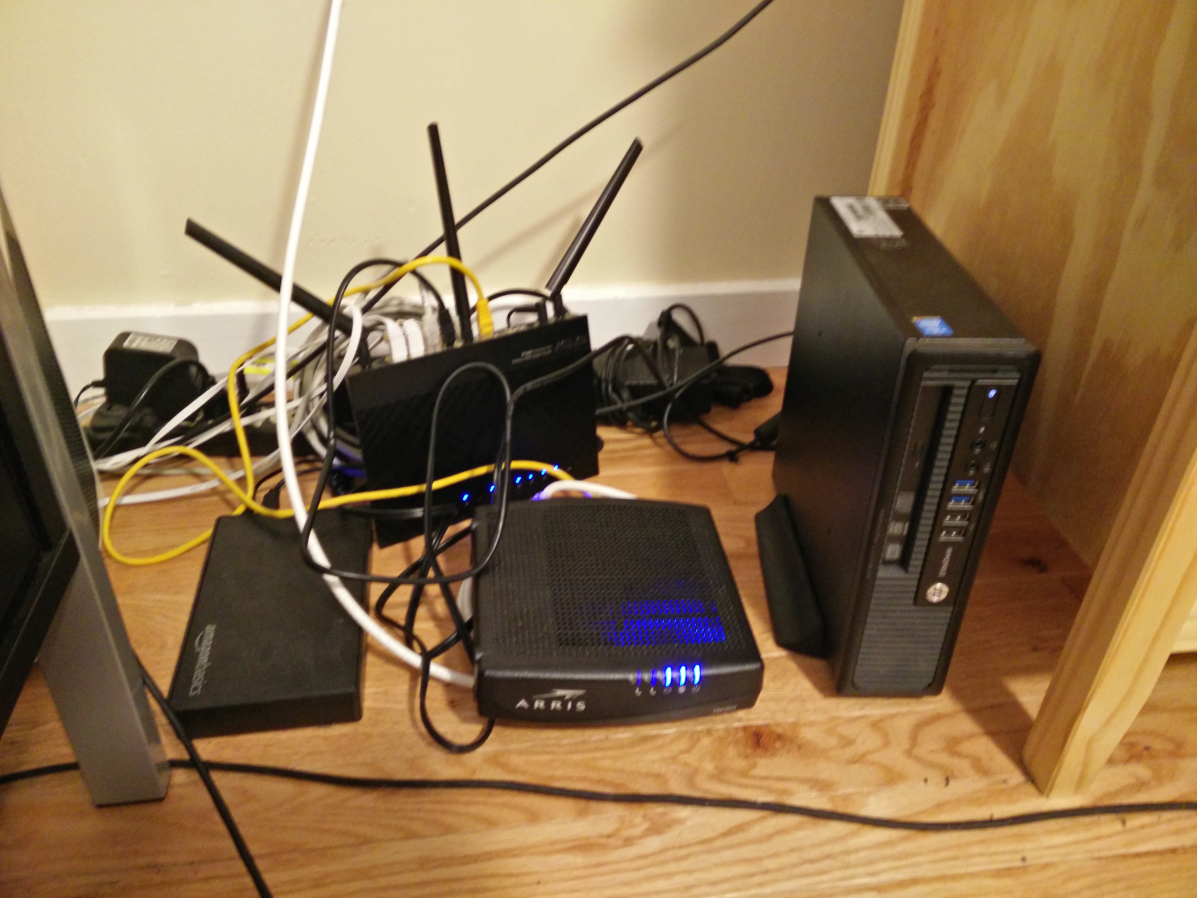
First, I installed Ubuntu Server 18.04 GNU/Linux on the server, and set up an SSH connection from my main desktop. From there, I installed nginx and used it to configure a reverse proxy so I could have multiple servers with different domains running on the same machine. I acquired an SSL certificate from Let's Encrypt, and set an nginx rule to rewrite all HTTP requests to HTTPS. With this and other security measures in place, I cloned the website from GitHub and changed my DNS records, and now I was hosting my very own piece of the world wide web.
Before this point I had very little GNU/Linux experience, and had never interacted with a computer purely through the command line interface. The process of learning everything was slow and frustrating at first. As is often the case with these things, nearly everything that could go wrong did go wrong. But I got it working in the end, and learned a lot about GNU/Linux and system administration along the way.
This setup lasted for almost a year. But by May 2019 the original server was starting to show its age and it was time to upgrade to something more powerful. Read more about it below.
New Design
In April 2019, about a year after I first started working on the website, I decided to revamp it with a fresh design. The original design wasn't responsive on mobile, and my style.css was full of accumulated cruft from when I was first learning web design. I wanted a fresh start to show off my newfound mastery of flexboxes, transition animations, and responsive design.
The original site is preserved in a separate branch for posterity, and is still live on the web here.
This design was good enough (and actually helped me get a job), but the accumulation of janky CSS hacks over a year made it difficult to add to it consistently. The navigation bar also relied on hover states, which made it unusable on mobile. Instead of hacking together a fix for the existing 500-line stylesheet I decided to start over.
Design Principles
I designed the new website style with these principles in mind:
- Simplicity: the site should be simple and easy to read, with a minimal number of unique elements and different colors
- Mobile compatibility: everything should look good and be usable on mobile, but the desktop experience should not be sacrificed for this
- Extensibility: It should be easy for me to add new elements and different kinds of pages in the future
Navigation Bar
In desktop mode, the navigation bar remains mostly the same since the previous version, but gains some fancy new transition animations. However, in mobile mode it changes into an expanding side-menu with a @media CSS selector. Originally this behavior was implemented with JavaScript, but I wanted my site to be navigable with scripts disabled, so I replaced this mechanism with pure CSS.
It works through a well-known CSS hack, involving an invisible checkbox
and abuse of the "~" sibling selector. An invisible
checkbox element lurks out of sight on every page, while its
label elements wrap the "Menu" and "Close" buttons. When
you click the label of a checkbox, it toggles the actual element's
checked status. The label doesn't have to be anywhere near the actual
checkbox, and the checkbox itself can be invisible, allowing you to
toggle styling of arbitrary elements using pure CSS with a selector like
this:
nav {
  height: 100%;
  position: fixed;
  left: 0;
  top: 0;
  width: 0;
  transition: width .8s;
  z-index: 2;
  background-color: #005377;
  overflow: auto;
  white-space: nowrap;
}

input[type=checkbox]:checked ~ nav {
  width: 100%;
}
The invisible checkbox is right next to the nav, so we can
use the general sibling combinator (~) to style it.
The @media selector makes the site dynamically adjust as the viewport width is changed. The animation the shows the nav-bar opening is just a CSS transition:
Heading Background
The light textured background behind page titles is also just a simple CSS trick. Each page's main element has a ::before pseudo-element positioned behind the top of the page. This pseudo-element has a composite background image, consisting of a small, mostly-transparent image repeated across the page, and a gradient to create the "fading out" effect.
The image itself is quite small, less than 90 kiB, and everything else is rendered client-side, which keeps load times fast.

particles.js
For the background of the index page I used
particles.js, a
lightweight, free JavaScript library for creating particle effects. It's
configured with a simple JSON file and sits on top of a
::before pseudo-element with a slightly lighter background
color that fades to the standard background color with a linear
gradient. It creates a neat effect without being obtrusive, and if you
have JavaScript disabled it doesn't break any important functionality.
Getting an Upgrade
Note: This section is now out of date as I just host everything on K3s Kubernetes now. I'm leaving it here as a record of my learning process.
By May of 2018 the old HP EliteDesk I had been using as a server was starting to get sluggish. The number of services I was running had steadily increased over the ten months it was active, and the server could no longer keep up. It was also horribly insecure, and the accumulation of cruft made it hard to add anything new.
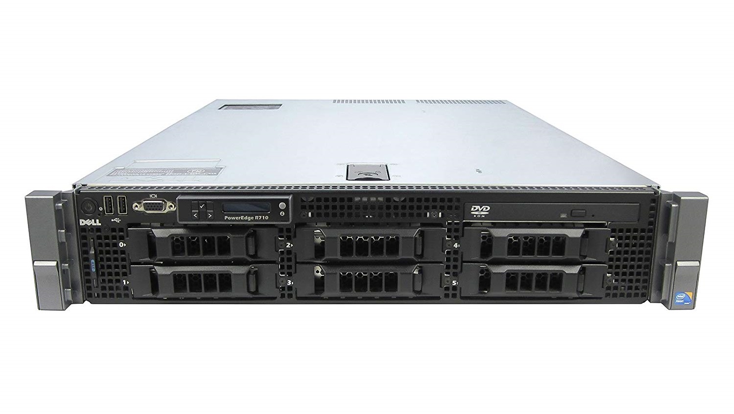
For better security and performance, I decided to switch to a virtual environment running on real enterprise-level server hardware. Building a custom network of virtual machines would allow me to split up the various services I was running and learn more about system administration and networking.
I could have just used AWS for this task, but I wanted to set things up manually so I could learn the process. I also didn't want to have to rely on an external provider, whose prices could increase in the future. I purchased a used Dell PowerEdge R710 for the task, along with a new RAID card and some new hard drives.
This time around I had a lot more GNU/Linux experience, and felt more confident in my abilities. I chose CentOS as the OS to run on bare metal, and set up libvirt with QEMU for virtualization. For high-level VM management I used Foreman, which allows me to easily provision and manage hosts on my network. With these tools, I can create a new virtual machine, have it PXE boot into an installer image, install a GNU/Linux operating system, update and install necessary packages, configure a network interface for my virtual and physical networks, automatically create entries for my internal DNS server, set up users and remote execution SSH keys, and register them with Puppet, all completely unattended. Admittedly, it took a long time to get all of these services to work together nicely, but it was worth it in the end.
For the virtual servers I chose to run Fedora 30. One of them runs nginx as a reverse proxy and serves the static pages of this websites, while others provide other services, each neatly compartmentalized and separated. SELinux and firewalld allow only what each server needs to function.
Once again, almost everything that could go wrong did go wrong in this process. Because I couldn't find an up-to-date guide to installing Foreman and libvirt I created my own, here and here. It took over a month between when I bought the new server and when it was fully operational, but I learned a lot in that time. If I had to start over from scratch I could probably recreate the entire network in a day at this point.